How to use
- Pick a Base color with the color picker or type a HEX code such as #3B82F6.
- Choose a Color harmony: Complementary, Triadic, Analogous, Split-Complementary, Tetradic or Monochromatic.
- Read each swatch's HEX and HSL values. Click a swatch to copy its HEX code.
- Click Copy all HEX to copy the whole palette, ready to paste into CSS, Figma, Canva or a brand guide.
How color harmonies work
Every harmony starts from the base color's position on the color wheel (its hue, from 0 to 360 degrees) and adds colors at fixed angles. Saturation and lightness stay the same as the base, so the colors feel like one family. Monochromatic is the exception: it keeps the hue and changes only the lightness.
For example, the default blue #3B82F6 sits at a hue of about 217°. Its complementary color is the orange #F6AF3C, 180° away, and its triadic partners are a pink (#F63C83) and a green (#83F63C), 120° apart.
| Harmony | Colors | Hue steps from the base | Feels |
|---|---|---|---|
| Complementary | 2 | +180° | Strong contrast, good for one accent |
| Split-Complementary | 3 | +150°, +210° | Contrast with less tension |
| Triadic | 3 | +120°, +240° | Bright and playful |
| Analogous | 4 | −30°, +30°, +60° | Calm, natural |
| Tetradic | 4 | +90°, +180°, +270° | Rich; needs one dominant color |
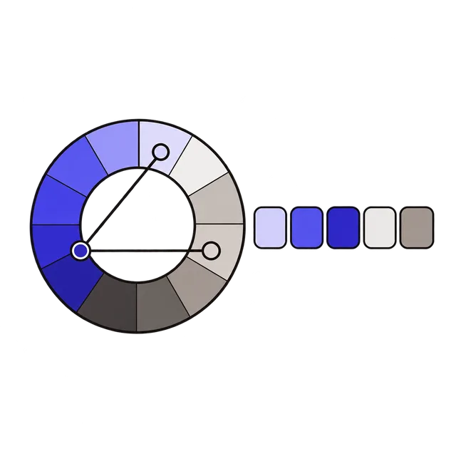
| Monochromatic | 5 | Same hue, lightness −40 to +40 | Clean and consistent |
Turning a palette into a design
A palette is a set of options, not a rule to use every color equally. A common approach is 60-30-10: about 60% of the space in a neutral or the lightest color, 30% in a secondary color and 10% in the accent, which is usually the base or its complement. Keep the strongest color for buttons and links so they stand out.
Monochromatic palettes are a quick way to get matching shades for backgrounds, borders, hover states and text. Note that the lightest step can reach pure white (#FFFFFF) and the darkest can get close to black when the base is already very light or very dark; pick a base in the middle range for five usable shades.
Check contrast before you use it
Harmony is about how colors look together, not whether text on them is readable. Colors at the same lightness, like the triadic set above, often have too little contrast for text on top of each other. Before using a pair for text and background, test it in the Contrast Checker: WCAG asks for at least 4.5:1 for normal text and 3:1 for large text.
Frequently asked questions
What is a complementary color?
The color directly opposite on the color wheel, 180° away. Blue and orange, or red and cyan, are complementary pairs. They give the strongest contrast in hue.
Why does my base color's HEX change slightly?
The palette is calculated in HSL with whole-number values, so converting back to HEX can shift a channel by one step, for example #3B82F6 to #3C83F6. The difference is not visible.
Can I use these colors in Tailwind or CSS?
Yes. Copy the HEX codes and use them as CSS custom properties or as colors in your Tailwind config. The HSL values can be pasted into CSS as hsl() as well.
Is anything uploaded?
No. The palette is calculated in your browser.